Healthy

Case study. Jul/Aug 2025

The product and the goal

Healthy is a digital service that enables a fast and smart relationship with one’s family doctor. Users are aged 16 and above, most of whom are workers. The goal of Healthy is to simplify and speed up the interaction between doctors and patients, offering patients a complete service to keep everything related to their health at hand.
Homepage healthy mockup

My role & responsibilities

Logo per finestra browser
Type of project: personal
Role: generalist UX designer leading the design of Healthy
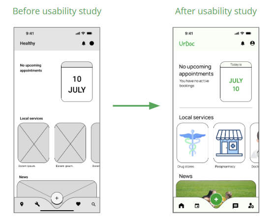
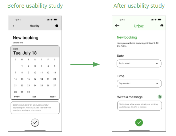
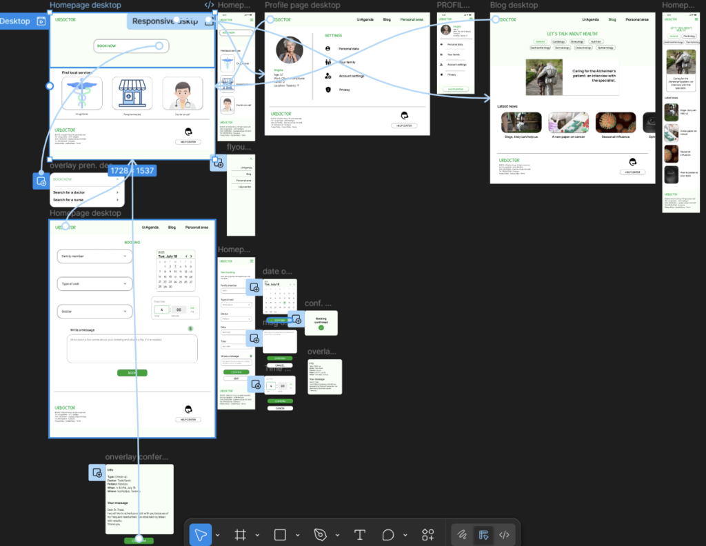
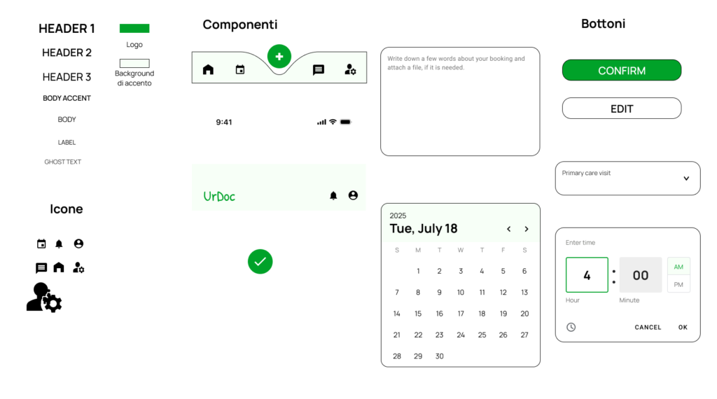
Responsibilities: conducting interviews, paper and digital wireframing, low and high-fidelity prototyping, conducting usability studies, accounting for accessibility, iterating on designs and responsive design.

Understanding the user

SUMMARY
After foundational research, three types of users were identified: patients, doctors, and secretaries. Interviews were conducted with each category to build empathy maps and understand the needs and pain points of these stakeholders.
PAIN POINTS
Contacts
Patients often struggle to get in touch with thepractice, or the process takes
too long.
Queue
Patients get frustrated when appointments are hard to book or scheduled too far in the future
Secretary’s overload
Secretaries struggle to manage multiple doctors’ agendas while also being the first point of contact for patients.
Elderly patients
Doctors find it difficult to communicate with older patients or to assume that they can use technology.
PERSONAS
As said, three types of users were identified. In this cas study we will discuss about one of them.
Persona paziente

Angela - patient

Goals

– Wants to be heard
– Book an appointment
– To receive care

Frustrations

– Difficult to get in contact with the doctor’s office
– Long-term bookings
– Struggle with poor interal comunication of the office
Age: 57
Work: City-hall employee
Family: 2
Location: Taranto, IT
Bio: Angela is a city hall employee who lives with her husband. She has a chronic condition, so she often needs the doctor’s support and prescriptions. She works full time and doesn’t have much time to spend at the doctor’s office. She has a long medical history, so she needs the doctor to stay up to date on her issues
“I’d like to leave a note about the reason for my booking, so the doctor will be aware of my needs”
USER JOURNEY MAP
Mapping out the flow of Angela’s journey reveal that using technology that allows users to self-schedule appontments and leave notes could vbe useful.
User Journey map di Angela

Starting the design

SITEMAP
Having difficulty getting in touch was a key pain point for users, so I focused mu work on addressing it. The structure I chose was designed to make things simnple and easy.
Sitemap
PAPER WIREFRAMES
Starting from the APP with this homepage wireframe, I wanted to explore how a clear and uncluttered screen could guide the user, allowing them to easily navigate the app or take actions such ad making a new booking.
Sitemap 1
PAPER WIREFRAMES
Starting from the APP with this homepage wireframe, I wanted to explore how a clear and uncluttered screen could guide the user, allowing them to easily navigate the app or take actions such ad making a new booking.
Sitemap 1
Sitemap 2
PAPER WIREFRAMES SCREEN SIZE VARIATION(S)
Because Healthy’s customers acces the service on a variety of different devices, I started to work on designs for additional screen sizes to make sure the site would be fully responsive.
LO-FI MOCKUPS
At this point, I conduced a usability study using lo-fi mockups made in Figma, to understand wheter my proposal was meeting users’ needs.
PARAMETERS
Study type
Unmoderated usabilty study
Location
Italy, remote
Partecipants
6
Lenghts
15-20 minutes
FINDINGS
1
Users need to find easily the “leave a message”
feature
2
Users would have the possibility to attach documents during the booking process
3
Users want a
messages section
APP MOCKUPS
These images summarize the iterations carried out after two usability testing sessions, evolving from the initial lo-fi version to the final hi-fi prototype.
WEBSITE MOCKUPS
A website was also designed. The concept was tested through two usability testing sessions, after which I worked on screen variations to make it usable across different devices.
Profile page desktop
Blog desktop
SCREENSIZE VARIATIONS
A website was also designed. The concept was tested through two usability testing sessions, after which I worked on screen variations to make it usable across different devices.
HOMEPAGE RESPONSIVE
BOOKING RESPONSIVE
HIGH FIDELITY PROTOTYPE
My hi-fi prototype followed the same user flow as the lo-fi prototype, and included the design changes made after the usability study.
PROTOTYPE BOARD IMAGE
DESIGN SYSTEM
To ensure consistency and efficiency, a design system was developed to guide the interface and component structure.
DESIGN SYSTEM
ACCESSIBILITY CONSIDERATIONS
At this point, I conduced a usability study using lo-fi mockups made in Figma, to understand wheter my proposal was meeting users’ needs.
1
The 60-30-10 rule was applied to create a visually appealing and accessible app.

2
Colours were chosen with attention to the contrast ratio.

3
A system of labels and annotations was included to improve readability for screen readers and to support users with accessibility needs.
annotation_accessibility

Contact me

© 2025 Fabrizio Paladini. All rights reserved